1st approach/ sketches

building italic version

what makes Cicero unique
About
Lizette Hechavarria & Ernesto Anton
The client
The Superior Institute of Design (ISDi, stands for Instituto Superior de Diseño) is the only institution of higher education in Cuba dedicated to training professionals in the fields of Graphic, Industrial, and Fashion Design.
Our main goal was to create a font family that could take ownership of the institute’s defining character and would enhance the visual projection of their promotional and informational materials.
Concept
Highly rigorous by typology and its target audience -as it would be consumed and questioned by design students and professionals in related fields- this project was set up to deliver a font family where readability prevailed, based on a study of the anatomy of different typefaces. ISDi is well-known for following the Bauhaus design principles of a pragmatic approach to design, where its most basic tenet is: form follows function.
Therefore excellent legibility was our main goal, created by an open aperture of the counter and an optimized optical kerning.
Implementation
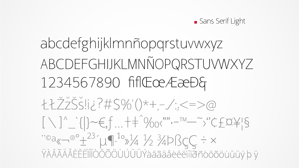
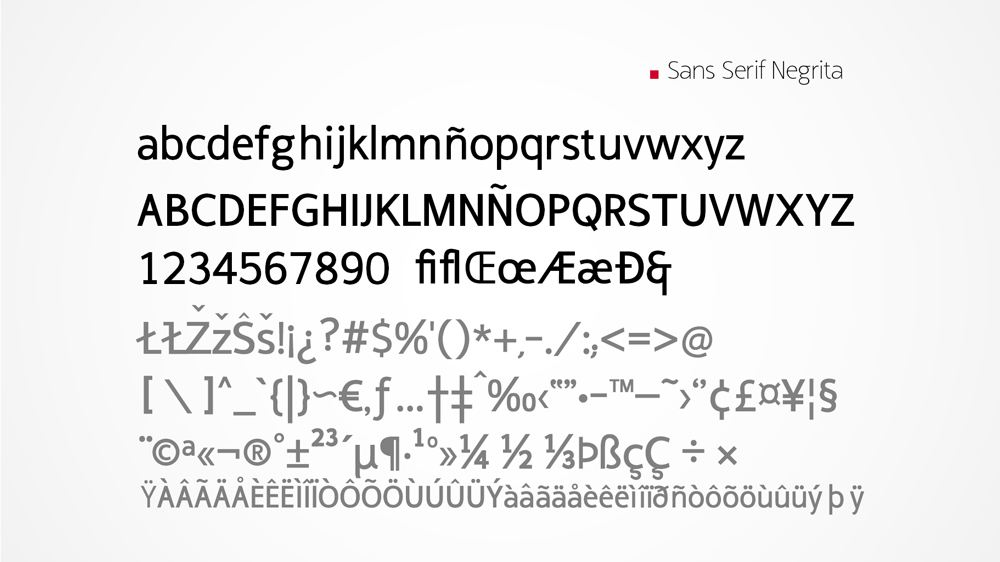
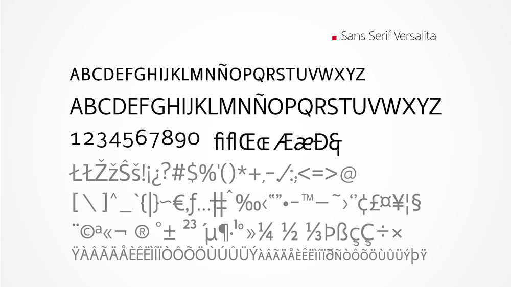
The Cícero font family includes 3 weights (light, regular and bold) and 3 morphological versions like serif, italic and small caps.